Use TabView to create tabs in SwiftUI. This article demonstrates how to create tabs in SwiftUI.
Basic Structure
The TabView is used in the following structure.
struct ContentView: View {
    var body: some View {
        TabView {
            // --- START ---
            // The view in the tab.
            Text("Tab 1") // The tab item root view.
                .tabItem {
                    // The view displayed in the label
                    Text("Item 1")
                }
            // --- END ---

            // --- START ---
            // The view in the tab.
            Text("Tab 2") // The tab item root view.
                .tabItem {
                    // The view displayed in the label
                    Text("Item 2")
                }
            // --- END ---

            // --- START ---
            // The view in the tab.
            Text("Tab 3") // The tab item root view.
                .tabItem {
                    // The view displayed in the label
                    Text("Item 3")
                }
            // --- END ---

            // As above, repeat from "START" to "END" for each tab item.
        }
    }
}
About TabView
TabView serves as a container view within SwiftUI. It displays the sub-view as a tab item.
About tabItem modifier
The tabItem modifier creates the label of the tab item.
Preview for each platform
When you run the above code, it will display as shown on the iPhone.
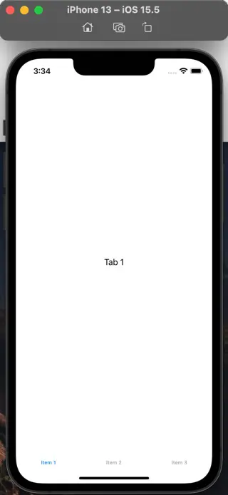
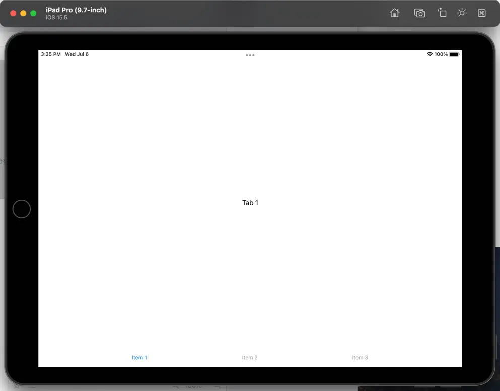
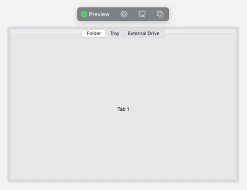
It displays as follows on iPad.
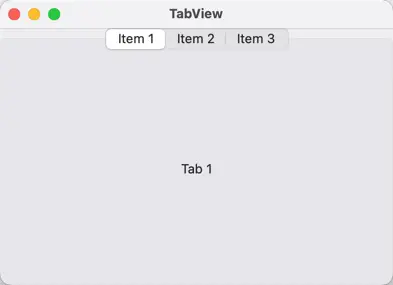
It displays as follows on macOS.
How to create labels
Use tabItem modifier to create the tab labels. Next, you specify the view to be displayed as the argument, which is a closure. Writing it using trailing closure syntax is similar to defining subviews.
Text-only labels
You can create text-only labels by using the Text modifier, as demonstrated in the sample code above.
.tabItem {
    Text("Label Title")
}
Icon-only labels
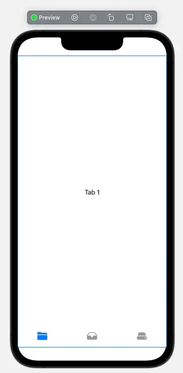
You create Icon-only labels using Image instead of Text.
import SwiftUI

struct ContentView: View {
    var body: some View {
        TabView {
            Text("Tab 1")
                .tabItem {
                    Image(systemName: "folder")
                }
            Text("Tab 2")
                .tabItem {
                    Image(systemName: "tray")
                }
            Text("Tab 3")
                .tabItem {
                    Image(systemName: "externaldrive")
                }
        }
    }
}
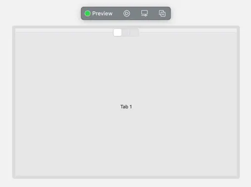
However, keep in mind that macOS apps cannot display images in labels, leaving them blank.
Labels combining icons and text
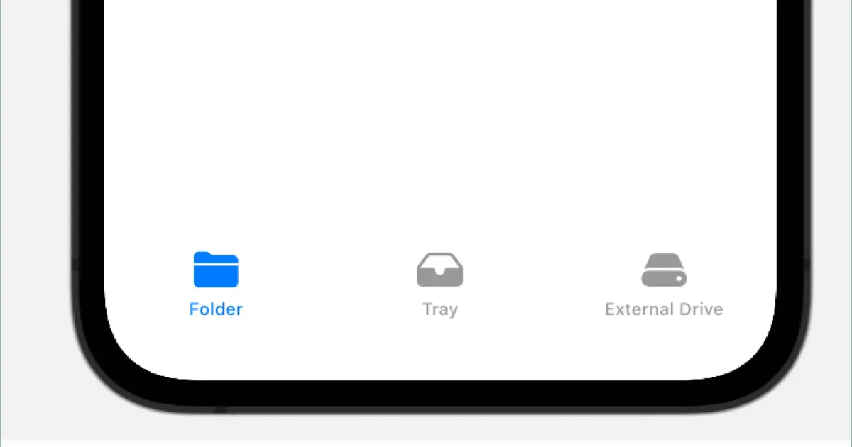
To create a label that combines an icon and text, use VStack to display the Image and Text side by side, as you would when defining any other view.
import SwiftUI

struct ContentView: View {
    var body: some View {
        TabView {
            Text("Tab 1")
                .tabItem {
                    VStack {
                        Image(systemName: "folder")
                        Text("Folder")
                    }
                }
            Text("Tab 2")
                .tabItem {
                    VStack {
                        Image(systemName: "tray")
                        Text("Tray")
                    }
                }
            Text("Tab 3")
                .tabItem {
                    VStack {
                        Image(systemName: "externaldrive")
                        Text("External Drive")
                    }
                }
        }
    }
}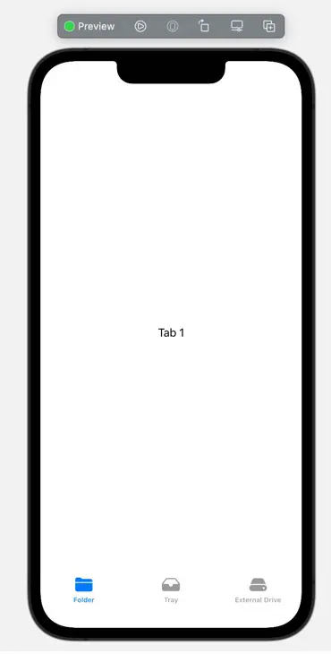
Note that even if you use HStack to display images and text horizontally, they will line up vertically. Only vertical orientation is supported.
Also, macOS apps cannot display images, only text.
Margins around tabs
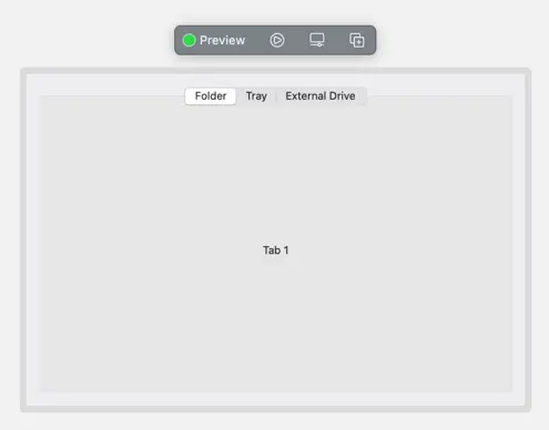
For macOS applications, you can add margins using the padding modifier. Otherwise, the window frame and tab frame will be adjacent.
struct ContentView: View {
    var body: some View {
        TabView {
            Text("Tab 1")
                .tabItem {
                    VStack {
                        Image(systemName: "folder")
                        Text("Folder")
                    }
                }
            Text("Tab 2")
                .tabItem {
                    VStack {
                        Image(systemName: "tray")
                        Text("Tray")
                    }
                }
            Text("Tab 3")
                .tabItem {
                    VStack {
                        Image(systemName: "externaldrive")
                        Text("External Drive")
                    }
                }
        }
        #if os(OSX)
            .padding()
        #endif
    }

}
As mentioned above, the #if os(OSX) directive applies the .padding() modifier only for macOS applications.
Introduction to my book
I wrote the book titled “基礎から学ぶ SwiftUI”. This book explains the basic view of SwiftUI, not only TabView.

For more information, please see the above article.